Although the golden age of IE8 has already passed and Microsoft
already has stopped its support, this browser still occupies about
3% of the of the world market desktop browsers. Despite this, many big organisations still
use this browser for enterprise web applications. We may confirm this, since we deal with
such organisations around the world. Companies try to get rid of IE8, but this
often requires Windows upgrade and resources to re-test all their web applications. If such company has many web terminals with Windows 7 or even with XP, this task becames rather expensive. So, this process
advances rather slowly. Meanwhile, these organizations don't stop development of new
web applications that must work on new HTML5 browsers and on old IE8.
A year ago we had developed an
UIUpload AngularJS directive and service that simplifies file uploading in web applications with AngularJS client. It works as expected on all HTML5 browsers.
But few days ago, we were asked to help with file uploading from
AngularJS web application that will work in IE8. We've spent few hours in order to investigate
existing third-party AngularJS directives and components. Here are few of them:
All of these directives for IE8 degrade down to <form> and <iframe> and then track the uploading progress. These solutions don't allow to select files for old browsers. At the same time, our aim was to implement an AngularJS directive that allows selecting a file and perform uploading, which will work for IE8 and for new browsers too.
Since IE8 neither supports FormData nor File API, thus, the directive must work with DOM elements directly. In order to open file selection dialog we need to hide <input type="file"/> element and then to route client-side event to it. When a file is selected it is sent to a server as multipart/form-data message. The server's result will be caught by hidden <iframe> element and passed to the directive's controller.
After few attempts we've implemented the desired directive. The small VS2015 solution that demonstrates this directive and server-side file handler you may download here.
The key feature of this directive is emulation of replace and template directive's definition properties:
       var directive =
       {
          restrict: "AE",
          scope:
          {
            id: "@",
            serverUrl: "@",
            accept: "@?",
            onSuccess: "&",
            onError: "&?",
          },
          link: function (scope, element, attrs, controller)
          {
            var id = scope.id || ("fileUpload" + scope.$id);

            var template = "<iframe name='%id%$iframe' id='%id%$iframe' style='display: none;'>" +
              "</iframe><form name='%id%$form' enctype='multipart/form-data' " +
              "method='post' action='%action%' target='%id%$iframe'>" +
              "<span style='position:relative;display:inline-block;overflow:hidden;padding:0;'>" +
              "%html%<input type='file' name='%id%$file' id='%id%$file' " +
              "style='position:absolute;height:100%;width:100%;left:-10px;top:-1px;z-index:100;" +
              "font-size:50px;opacity:0;filter:alpha(opacity=0);'/></span></form>".
                replace("%action%", scope.serverUrl).
                  replace("%html%", element.html()).
                    replace(/%id%/g, id);

            element.replaceWith(template);
            ...
          }
       }
We used such emulation, since each directive instance (an element) must have unique name and ID in order to work properly. On the one hand template that returned by function should have a root element when you use replace. On the other hand, IE8 doesn't like such root element (e.g. we've not succeeded to dispatch the click javascript event to the <input> element).
The usage of the directive looks like as our previous example (see UIUpload):
    <a file-upload=""
      class="btn btn-primary"
      accept=".*"
      server-url="api/upload"
      on-success="controller.uploadSucceed(data, fileName)"
      on-error="controller.uploadFailed(e)">Click here to upload file</a>
Where:
- accept
- is a comma separated list of acceptable file extensions.
- server-url
-
is server URL where to upload the selected file.
In case when there is no "server-url" attribute the content of selected file will be
passed to success handler as a data URI.
- on-success
- A "success" handler, which is called when upload is finished successfully.
- on-error
- An "error" handler, which is called when upload is failed.
We hope this simple directive may help to keep calm for those of you who is forced to deal with IE8 and more advanced browsers at the same time.
Angular 2 is already available though there are a lot of code and libraries that are still in Angular 1.x.
Here we outline how to write AngularJS 1.x in the modern javascript.
Prerequisites: EcmaScript 2015, javascript decorators, AngularJS 1.x. No knowledge of Angular 2.0 is required.
Please note that decorators we have introduced, while resemble those from Angular 2, do not match them exactly.
A sample uses nodejs, npm and gulp as a building pipeline. In addition we have added Visual Studio Nodejs project, and maven project.
Build pipeline uses Babel with ES 2015 and decorator plugins to transpile sources into javascript that today's browsers do support. Babel can be replaced or augmented with Typescript compiler to support Microsoft's javascript extensions. Sources are combinded and optionally minified into one or more javascript bundles. In addition html template files are transformed into javascript modules that export a content of html body as a string literals. In general all sources are in src folder and the build's output is assembled in the dist folder. Details of build process are in gulpfile.js
So, let's introduce an API we have defined in angular-decorators.js module:
-
Class decorators:
Component(name, options?) - a decorator to register angular component.Controller(name) - a decorator to register angular controller.Directive(name, options?) - a decorator to register angular directive.Injectable(name) - a decorator to register angular service.Module(name, ...require) - a decorator to declare an angular module;Pipe(name, pure?) - a decorator to register angular filter.
Component's and Directive's options is the same object passed into Module.component(), Module.directive() calls with difference that no
options.bindings, options.scope, options.require is specified.
Instead @Attribute(), @Input(), @Output(), @TwoWay(), @Collection(), @Optional() are used to describe options.bindings, and
@Host(), Self(), SkipSelf(), @Optional() are used to describe options.require
Every decorated class can use @Inject() member decorator to inject a service.
-
Member decorators:
Attribute(name?) - a decorator that binds attribute to the property.BindThis() - a decorator that binds "this" of the function to the class instance.Collection() - a decorator that binds a collection property to an expression in attribute in two directions.Host(name?) - a decorator that binds a property to a host controller of a directive found on the element or its ancestors.HostListener(name?) - a decorator that binds method to a host event.Inject(name?) - an injection member decorator.Input(name?) - a decorator that binds a property to an expression in attribute.Optional() - a decorator that optionally binds a property.Output(name?) - a decorator that provides a way to execute an expression in the context of the parent scope.Self(name?) - a decorator that binds a property to a host controller of a directive found on the element.SkipSelf(name?) - a decorator that binds a property to a host controller of a directive found on the ancestors of the element.TwoWay() - a decorator that binds a property to an expression in attribute in two directions.
If optional name is omitted in the member decorator then property name is used as a name parameter.
@Host(), @Self(), @SkipSelf() accept class decorated with @Component() or @Directive() as a name parameter.
@Inject() accepts class decorated with @Injectable() or @Pipe() as a name parameter.
-
Other:
modules(...require) - converts an array of modules, possibly referred by module classes, to an array of module names.
Now we can start with samples. Please note that we used samples scattered here and there on the Anuglar site.
@Component(), @SkipSelf(), @Attribute()-
In the Angular's component development guide there is a sample myTabs and myPane components.
Here its rewritten form
components/myTabs.js:
import { Component } from "../angular-decorators"; // Import decorators
import template from "../templates/my-tabs.html"; // Import template for my-tabs component
@Component("myTabs", { template, transclude: true }) // Decorate class as a component
export class MyTabs // Controller class for the component
{
  panes = []; // List of active panes
  select(pane) // Selects an active pane
  {
    this.panes.forEach(function(pane) { pane.selected = false; });
    pane.selected = true;
  }
  addPane(pane) // Adds a new pane
  {
    if (this.panes.length === 0)
    {
      this.select(pane);
    }
    this.panes.push(pane);
  }
}
components/myPane.js:
import { Component, Attribute, SkipSelf } "../angular-decorators"; // Import decorators
import { MyTabs } from "./myTabs"; // Import container's directive.
import template from "../templates/my-pane.html"; // Import template.
@Component("myPane", { template, transclude: true }) // Decorate class as a component
export class MyPane // Controller class for the component
{
  @SkipSelf(MyTabs) tabsCtrl; //Inject ancestor MyTabs controller.
  @Attribute() title; // Attribute "@" binding.
  $onInit() // Angular's $onInit life-cycle hook.
  {
    this.tabsCtrl.addPane(this);
    console.log(this);
  };
}
- @Component(), @Input(), @Output()
-
In the Angular's component development guide there is a sample
myTabs component.
Here its rewritten form
components/heroDetail.js:
import { Component, Input, Output } from "../angular-decorators";
import template from "../templates/heroDetail.html";
@Component("heroDetail", { template }) // Decorate class as a component
export class HeroDetail // Controller class for the component
{
  @Input() hero; // One way binding "<"
  @Output() onDelete; // Bind expression in the context of the parent scope "&"
  @Output() onUpdate; // Bind expression in the context of the parent scope "&"
  delete()
  {
    this.onDelete({ hero: this.hero });
  };
  update(prop, value)
  {
    this.onUpdate({ hero: this.hero, prop, value });
  };
}
@Directive(), @Inject(), @Input(), @BindThis()-
import { Directive, Inject, Input, BindThis } from "../angular-decorators"; // Import decorators
@Directive("myCurrentTime") // Decorate MyCurrentTime class as a directive
export class MyCurrentTime // Controller class for the directive
{
  @Inject() $interval; // "$interval" service is injected into $interval property
  @Inject() dateFilter; // "date" filter service is injected into dateFilter property
  @Inject() $element; // "$element" instance is injected into $element property.
  @Input() myCurrentTime; // Input one way "<" property.
  timeoutId;
  // updateTime is adapted as following in the constructor:
  //   this.updateTime = this.updateTime.bind(this);
  @BindThis() updateTime()
  {
    this.$element.text(this.dateFilter(new Date(), this.myCurrentTime));
  }
  $onInit() // Angular's $onInit life-cycle hook.
  {
    this.timeoutId = this.$interval(this.updateTime, 1000);
  }
  $onDestroy() // Angular's $onDestroys life-cycle hook.
  {
    this.$interval.cancel(this.timeoutId);
  }
  $onChanges(changes) // Angular's $onChanges life-cycle hook.
  {
    this.updateTime();
  }
}
@Directive(), @Inject(), @HostListener(), @BindThis()-
In the Angular's directive development guide there is a sample myDraggable directive.
Here its rewritten form. directives/myDraggable.js:
import { Directive, Inject, HostListener, BindThis } from "../angular-decorators"; // Import decorators
@Directive("myDraggable") // Decorate class as a directive
export class MyDraggable // Controller class for the directive
{
  @Inject() $document; // "$document" instance is injected into $document property.
  @Inject() $element;// "$element" instance is injected into $element property.
  startX = 0;
  startY = 0;
  x = 0;
  y = 0;
  // Listen mousedown event over $element.
  @HostListener() mousedown(event)
  {
    // Prevent default dragging of selected content
    event.preventDefault();
    this.startX = event.pageX - this.x;
    this.startY = event.pageY - this.y;
    this.$document.on('mousemove', this.mousemove);
    this.$document.on('mouseup', this.mouseup);
  }
  @BindThis() mousemove(event) // bind mousemove() function to "this" instance.
  {
    this.y = event.pageY - this.startY;
    this.x = event.pageX - this.startX;
    this.$element.css({
      top: this.y + 'px',
      left: this.x + 'px'
    });
  }
  @BindThis() mouseup() // bind mouseup() function to "this" instance.
  {
    this.$document.off('mousemove', this.mousemove);
    this.$document.off('mouseup', this.mouseup);
  }
  $onInit() // Angular's $onInit life-cycle hook.
  {
    this.$element.css(
    {
      position: 'relative',
      border: '1px solid red',
      backgroundColor: 'lightgrey',
      cursor: 'pointer'
    });
  }
}
@Injectable(), @Inject()-
In the Angular's providers development guide there is a sample notifier service.
Here its rewritten form. services/notify.js:
import { Inject, Injectable } from "../angular-decorators"; // Import decorators
@Injectable("notifier") // Decorate class as a service
export class NotifierService
{
  @Inject() $window; // Inject "$window" instance into the property
  msgs = [];
  notify(msg)
  {
    this.msgs.push(msg);
    if (this.msgs.length === 3)
    {
      this.$window.alert(this.msgs.join('\n'));
      this.msgs = [];
    }
  }
}
@Pipe()-
In the Angular's filters development guide there is a sample reverse custom filter.
Here its rewritten form. filters/reverse.js:
import { Pipe } from "../angular-decorators"; // Import decorators
@Pipe("reverse") // Decorate class as a filter
export class ReverseFilter
{
  transform(input, uppercase) // filter function.
  {
    input = input || '';
    var out = '';
    for(var i = 0; i < input.length; i++)
    {
      out = input.charAt(i) + out;
    }
    // conditional based on optional argument
    if (uppercase)
    {
      out = out.toUpperCase();
    }
    return out;
  }
}
- Module(), modules(), angular.bootstrap()
-
Here are an examples of a class representing angular module, and manual angular bootstrap:
import { angular, modules, Module } from "../angular-decorators"; // Import decorators
import { MyController } from "./controllers/myController"; // Import components.
import { HeroList } from "./components/heroList";
import { HeroDetail } from "./components/heroDetail";
import { EditableField } from "./components/editableField";
import { NotifierService } from "./services/notify";
import { MyTabs } from "./components/myTabs";
import { MyPane } from "./components/myPane";
import { ReverseFilter } from "./filters/reverse";
import { MyCurrentTime } from "./directives/myCurrentTime";
import { MyDraggable } from "./directives/myDraggable";
@Module( // Decorator to register angular module, and refer to other modules or module components.
  "my-app",
  [
    MyController,
    NotifierService,
    HeroList,
    HeroDetail,
    EditableField,
    MyTabs,
    MyPane,
    ReverseFilter,
    MyCurrentTime,
    MyDraggable
  ])
class MyApp { }
// Manual bootstrap, with modules() converting module classes into an array of module names.
angular.bootstrap(document, modules(MyApp));
Please see angular-decorators.js to get detailed help on decorators.
Some of our latest projects used file uploading feature. Whether this is an excel, an audio or an image file, the file uploading mechanism remains the same. In a web application an user selects a file and uploads it to the server. Browser sends this file as a multipart-form file attachment, which is then handled on server.
The default HTML way to upload file to server is to use <input type="file"> element on a form. The rendering of such element is different in different browsers and looks rather ugly. Thus, almost all well known javascript libraries like JQuery, Kendo UI etc. provide their own implementations of file upload component. The key statement here is "almost", since in AngularJS bootstrap we didn't find anything like that. It worth to say that we've found several third-party implementations for file upload, but they either have rather complex implementation for such simple task or don't provide file selection feature. This is the reason why we've decided to implement this task by ourselves.
Sources of our solution with upload-link directive and uiUploader service you may find here.
Their usage is rather simple.
E.g. for upload-ink directive:
      <a upload-link
       class="btn btn-primary"
       accept=".*"
       server-url="api/upload"
       on-success="controller.uploadSucceed(data, file)"
       on-error="controller.uploadFailed(e)">Click here to upload an image</a>
Where:
- accept
- is a comma separated list of acceptable file extensions.
- server-url
-
is server URL where to upload the selected file.
In case when there is no "server-url" attribute the content of selected file will be
passed to success handler as a data URI.
- on-success
- A "success" handler, which is called when upload is finished successfully.
- on-error
- An "error" handler, which is called when upload is failed.
Usage of uiUploader service is also easy:
      uiUploader.selectAndUploadFile("api/upload", ".jpg,.png,.gif").
        then(
            function(result)
            {
              // TODO: handle the result.
              //       result.data - contains the server response
              //       result.file - contains uploaded File or Blob instance.
            },
            $log.error);
In case when the first parameter is null the result.data contains the selected file content as a
data URI.
In a web project we needed to provide a region selection tool.
This requirement is resulted in a javascript module selectionTool, and in an angularjs wrappers selection, and clip.
There are samples test.html, and angularjs-test.html.
The module is implemented through SVG manipulation. Selection paths are defined in terms of SVG.
The simplest way to start with this API is through test pages.
From the client perspective API allows to:
- create a new selection - click and drag path;
- select/unselect selection - click selection overlay or image area;
- move selected path - drag selected overlay, or click arrow keys;
- move selected edge - drag selected edge;
- move selected vertex - drag selected vertex;
- delete selected path - Delete button;
- add selection vertex - double click or ctrl + click a selection edge;
- remove selection vertex - double click or ctrl + click a selection vertex;
- scale selection - shift + drag selection, or shift + arrow keys;
- rotate selection - ctrl + drag selection, or ctrl + arrow keys.
Sources can be found at GitHub: nesterovsky-bros/selection.
Here we show two snall directives that help to build fixed menu bar in your angularjs application.
There are two ideas behind:
- Expose element's bounds into a scope for a manipulation (ui-bounds directive).
- Allow to react to scroll DOM event (ui-scroll directive).
Directive implementation is very simple. See bounds.html at GitHub.
The use cases are also trivial to unerstand and implement. Take a look at two of them.
- Fixed menu:
<div ng-style="{paddingTop: headerBounds.height.toFixed() + 'px' }">
  <div style="position: fixed; z-index: 1; top: 0; width: 100%; background: menu"
    ui-bounds="headerBounds">My header</div>
  <div>
    long content that produces a scroll bar.
  </div>
</div>
- Synchronized scroll of table header
<div style="width: 50em; overflow: hidden; background: pink">
  <div style="position: relative"
    ng-style="{left: bodyBounds.left.toFixed() + 'px'}">header...<div>
</div>
<div style="width: 50em; height: 5em; overflow: auto; background: blue"
  ui-scroll>
  <div ui-bounds="bodyBounds">body...</div>
</div>
You can see the demo at: nesterovsky-bros/angularjs-api/master/angularjs/bounds.html.
In our angularjs projects we are often dealing with existing models that do not always fit to angularjs expectations.
Here is an example.
There is a model consisting of two arrays: for data, and for associated data. How to create an ng-repeat that displays data from both sources?
Consider a test controller (see a github sources, and a rawgit working sample):
model.controller(
  "Test",
  function()
  {
    this.records =
    [
      { name: "record 1", state: "Draft" },
      { name: "record 2", state: "Public" },
      { name: "record 3", state: "Disabled" },
      { name: "record 4", state: "Public" },
      { name: "record 5", state: "Public" }
    ];

    this.more =
    [
      { value: 1, selected: true, visible: true },
      { value: 2, selected: false, visible: true },
      { value: 3, selected: true, visible: true },
      { value: 4, selected: false, visible: false },
      { value: 5, selected: false, visible: true }
    ];

    this.delete = function(index)
    {
      this.records.splice(index, 1);
      this.more.splice(index, 1);
    };
  });
Basically there are three approaches here:
- Change model.
- Adapt model to a single collection.
ng-repeat over first array and access the second array using $index scope variable.
We argued like this:
- It is often not an option to change a model, as it's how business data are described.
-
A model adaptation when we build a single collection from original two collections, and synchronize it back (if required) may unnecessary complicate things.
-
Thus let's get associated items by
$index variable.
This is an example of ng-repeat use:
<table border="1">
  <tr>
    <th>[x]</th>
    <th>Name</th>
    <th>Value</th>
    <th>State</th>
    <th>Actions</th>
  </tr>
  <tr ng-repeat="item in test.records track by $index"
    ng-if="test.more[$index].visible">
    <td>
      <input type="checkbox" ng-model="test.more[$index].selected"/>
    </td>
    <td>{{item.name}}</td>
    <td>{{test.more[$index].value}}</td>
    <td>{{item.state}}</td>
    <td>
      <a href="#" ng-click="test.delete($index)">Delete</a>
    </td>
  </tr>
</table>
Look at how associated data is accessed: test.more[$index]... Our goal was to optimize that repeating parts, so we looked at ng-init directive.
Though docs warn about its use: "the only appropriate use of ngInit is for aliasing special properties of ngRepeat", we thought that our use of ng-init is rather close to what docs state, so we tried the following:
...
<tr ng-repeat="item in test.records track by $index"
  ng-init="more = test.more[$index]"
  ng-if="more.visible">
  <td>
    <input type="checkbox" ng-model="more.selected"/>
  </td>
  <td>{{item.name}}</td>
  <td>{{more.value}}</td>
  <td>{{item.state}}</td>
  <td>
    <a href="#" ng-click="test.delete($index)">Delete</a>
  </td>
</tr>
...
This code just does not work, as it shows empty table, as if ng-if is always evaluated to false. From docs we found the reason:
- the priority of the directive
ng-if is higher than the prirority of the ng-init, and besides ng-if is a terminal directive;
-
as result
ng-if directive is bound, and ng-init is not;
- when
ng-if is evaluated no $scope.more is defined, so more.visible is evaluated to false.
To workaround ng-init/ng-if problem we refactored ng-if as ng-if-start/ng-if-end:
...
<tr ng-repeat="item in test.records track by $index"
  ng-init="more = test.more[$index]">
  <td ng-if-start="more.visible">
    <input type="checkbox" ng-model="more.selected"/>
  </td>
  <td>{{item.name}}</td>
  <td>{{more.value}}</td>
  <td>{{item.state}}</td>
  <td ng-if-end>
    <a href="#" ng-click="test.delete($index)">Delete</a>
  </td>
</tr>
...
This code works much better and shows a correct content. But then click "Delete" for a row with Name "record 2" and you will find that updated table is out of sync for all data that come from test.more array.
So, why the data goes out of sync? The reason is in the way how the ng-init is implemented: its expression is evaluated just once at directive's pre-link phase. So, the value of $scope.more will persist for the whole ng-init's life cycle, and it does not matter that test.mode[$index] may have changed at some point.
At this point we have decided to introduce a small directive named ui-eval that will act in a way similar to ng-init but that:
- will run before
ng-if;
- will be re-evaluated when it's value is changed.
This is it:
module.directive(
  "uiEval",
  function()
  {
    var directive =
    {
      restrict: 'A',
      priority: 700,
      link:
      {
        pre: function(scope, element, attr)
        {
          scope.$watch(attr["uiEval"]);
        }
      }
    };

    return directive;
  });
The ui-eval version of the markup is:
...
<tr ng-repeat="item in test.records track by $index"
  ui-eval="more = test.more[$index]"
  ng-if="more.visible">
  <td>
    <input type="checkbox" ng-model="more.selected"/>
  </td>
  <td>{{item.name}}</td>
  <td>{{more.value}}</td>
  <td>{{item.state}}</td>
  <td>
    <a href="#" ng-click="test.delete($index)">Delete</a>
  </td>
</tr>
...
It works as expected both during initial rendering and when model is updated.
We consider ui-eval is a "better" ng-init as it solves ng-init's silent limitations. On the other hand it should not try to evaluate any complex logic, as it can be often re-evaluated, so its use case is to alias a sub-expression. It can be used in any context and is not limited to items of ng-repeat.
Source code can be found at github, and a working sample at rawgit.
Stackoverfow shows that people are searching How to intercept $resource requests.
Recently we have written about the way to cancel angularjs $resource requests (see Cancel angularjs resource request).
Here we apply the same technique to intercept resource request.
Consider a sample (nesterovsky-bros/angularjs-api/master/angularjs/transform-request.html):
 <!DOCTYPE html>

<html>

<head>


  <meta charset="utf-8" />


  <title>Intercept resource request</title>


  <style type="text/css">.ng-cloak { display: none; }</style>


  <script src="angular.js"></script>


  <script src="angular-resource.js"></script>


  <script>

    angular.module("app", ["ngResource"]).


    factory(


      "services",


      ["$resource", function ($resource)


      {


        return $resource(


          "http://md5.jsontest.com/",


          {},


          {


            MD5:


            {


              method: "GET",


              params: { text: null },


              then: function (resolve)


              {


                this.params.text = "***" + this.params.text + "***";


                this.then = null;


                resolve(this);


              }


            },


          });


      }]).


    controller(


      "Test",


      ["services", function (services)


      {


        this.value = "Sample text";


        this.call = function()


        {


          this.result = services.MD5({ text: this.value });


        }


      }]);


  </script>

</head>

<body ng-app="app" ng-controller="Test as test">


  <label>Text: <input type="text" ng-model="test.value" /></label>


  <input type="button" value="call" ng-click="test.call()"/>


  <div ng-bind="test.result.md5"></div>

</body>

    </html>
How it works.
$resource merges action definition, request params and data to build a config parameter for an $http request.- a
config parameter passed into an $http request is treated as a promise like object, so it may contain then function to initialize config.
- action's
then function may transform request as it wishes.
The demo can be found at transform-request.html
Having a strong experience in ASP.NET and JSF, we found angular's transclusion concept is obscure and counterintuitive. It took a while for both of us to grasp the transclude's ideas described the Developer Guide. We suspect that this is due to the bad design: a bad design leads to a bad wording.
The other consequence of the bad design is that the transclusion is limited to one template per directive, which limits the use of the feature.
Consider:
- A directive
my-page that encapsulates a page with menu and content.
my-page uses templateUrl: my-page.html to render the page.my-page.html defines two sites where menu and page content have to be embedded.- Two content fragments are passed to
my-page to fill content sites.
Unfortunately, you cannot immediately implement this design in angularjs. On the other hand ASP.NET's Master Pages, and JSF's ui:composition readily solve this task.
Here is one of JSF's approaches:
-
Define page template my-page.xhtml:
              <html xmlns="http://www.w3.org/1999/xhtml"

  xmlns:ui="http://java.sun.com/jsf/facelets"

  xmlns:h="http://java.sun.com/jsf/html">

  <h:body>


    <table>


  <tr>


    <td><ui:insert name="menu"/></td>


  </tr>


  <tr>


    <td><ui:insert name="content"/></td>


  </tr>


</table>


  </h:body>

    </html>
-
Use
ui:composition tag to pass parts to the template:
              <html xmlns="http://www.w3.org/1999/xhtml"

  xmlns:ui="http://java.sun.com/jsf/facelets"

  xmlns:h="http://java.sun.com/jsf/html">

  <h:body>


    <ui:composition template="my-page.xhtml">

      <ui:define name="content">

        My Content

      <ui:define>

        <ui:define name="menu">

        <a href="#file">File</a>

        <a href="#edit">Edit</a>

        <a href="#view">View</a>

      <ui:define>


</ui:composition>


  </h:body>

    </html>
We have decided to model angular directives after JSF, and have defined three simple directives: ui-template, ui-insert, ui-define (see angularjs-api/template/ui-lib.js).
To define a template one writes the following markup (see angularjs-api/template/my-page.html):
<table ui-template>


  <tr>


    <td ui-insert="menu"></td>


  </tr>


  <tr>


    <td ui-insert="content"></td>


  </tr>

</table>
and declares a directive (see angularjs-api/template/my-page.js):
  var myPage =

  {


    templateUrl: "my-page.html",


    transclude: true

  };


  angular.module("app").


    directive("myPage", function() { return myPage; });
and finally, to instantiate the directive one needs to write (see angularjs-api/template/sample.html):
<my-page>


  <div ui-define="content">


    My content


  </div>


  <div ui-define="menu">


    <a href="#file">File</a>


    <a href="#edit">Edit</a>


    <a href="#view">View</a>


  </div>

</my-page>
The working sample can be seen through rawgit: sample.html
The other sample that integrates with routing can be found at sample-routing.html
Much time has passed since we fixed or extended Languages Xml Object Model.
But now we needed to manipulate with and generate javascript programs.
Though xslt today is not a language of choice but rather niche language, it still fits very well to tasks of code generation and transformation.
So, we're pleased to announce ECMAScript Xml Object Model, which includes:
All sources are available at github: https://github.com/nesterovsky-bros/languages-xom
Two years ago, when we were still actively using KendoUI we had published our approach on how to introduce custom widgets, which we called User Controls.
We even suggested to introduce UserControl widget into KendoUI core through feedback page.
At that time we got a response from KendoUI team:
Our recommended approach for building reusable app building blocks is expressed via the Kendo UI SPA features delivered earlier this year. Here’s a getting started resource if you’ve not already seen it: http://www.kendoui.com/blogs/teamblog/posts/13-05-16/kendo-ui-spa-screencast-and-getting-started.aspx
It was not clear how the response is related to the suggestion, but we decided not to rebuke the team, and to proceed with our user controls.
Nowdays we use KendoUI no more, and have completely switched to angularjs. Ocasionally, however, we need to support old projects, and peek into docs. Today we've discovered that the team has changed their mind, and allowed custom widgets: "Create Your Own Kendo UI Widget by Inheriting from the Base Widget Class". That's good news!
But the most interesting thing is that the design of their custom widget is very close to what we have suggested then.
Angularjs is reasonaly good library but as many other big frameworks it tries to absorb every role in itself. This leads to code bloat of the framework and often limits developers with API available.
This problem repeats in angularjs on different levels. The top manifistation is module system.
Authors defined notion of module and registry for controllers, providers, directives, and so on. This is an example from Angularjs doc:
var myModule = angular.module('myModule', []);


// add some directives and services

myModule.service('myService', ...);

myModule.directive('myDirective', ...);
This API directs developers to build angularjs centric applications, because it's where module and registry is defined.
At the same time there exists de-facto standard API called Asynchronous Module Definition (AMD) to specify a mechanism for defining modules and their dependencies. This API has several implementations, where requirejs is, probably, the best known one. This is an AMD example:
define(["./cart", "./inventory"], function(cart, inventory) {


        return {


            color: "blue",


            size: "large",


            addToCart: function() {


                inventory.decrement(this);


                cart.add(this);


            }


        }

    });
Every angularjs artifact can be mapped to AMD module. This could work equally well both at run time, and during unit tests. Without custom module implementation angularjs would be smaller, and more modular, so developer could pick up only required components. At the same time with AMD angularjs could treat many existing javascript classes as controllers and services without specific adaptation. Again, being more modular angularjs could provide multiple implementations of the same feature like jqLite vs jQuery, or $q vs native promises, for a developer to select.
So, we think modules in angularjs is a flaw, whose correction would improve it in many ways.
We needed to cancel angularjs $resource requests but have found that it's not trivial, though $http service has timeout property that allows to pass a promise that aborts a request when resolved.
So, we took a little time and divised a code to be able to cancel such requests.
Consider a sample (nesterovsky-bros/angularjs-api/master/angularjs/cancel-resource.html):
<!DOCTYPE html>
<html>
<head>
  <meta charset="utf-8" />
  <title>Cancel resource</title>
  <style type="text/css">
    .ng-cloak { display: none; }
  </style>
  <script src="angular.js"></script>
  <script src="angular-resource.js"></script>
  <script>
angular.module("app", ["ngResource"]).
factory(
  "services",
  ["$resource", function($resource)
  {
    function resolveAction(resolve) // #1
    {
      if (this.params)
      {
        this.timeout = this.params.timeout;
        this.params.timeout = null;
      }

      this.then = null;
      resolve(this);
    }

    return $resource(
      "http://md5.jsontest.com/",
      {},
      {
        MD5:
        {
          method: "GET",
          params: { text: null },
          then: resolveAction // #2
        },
      });
  }]).
controller(
  "Test",
  ["services", "$q", "$timeout", function(services, $q, $timeout)
  {
    this.value = "Sample text";
    this.requestTimeout = 100;

    this.call = function()
    {
      var self = this;

      self.result = services.MD5(
      {
        text: self.value,
        timeout: $q(function(resolve) // #3
        {
          $timeout(resolve, self.requestTimeout);
        })
      });
    }
  }]);
  </script>
</head>
<body ng-app="app" ng-controller="Test as test">
  <label>Text: <input type="text" ng-model="test.value" /></label><br/>
  <label>Timeout: <input type="text" ng-model="test.requestTimeout" /></label><br/>
  <input type="button" value="call" ng-click="test.call()"/>
  <div ng-bind="test.result.md5"></div>
</body>
</html>
How it works.
$resource merges action definition, request params and data to build a config parameter for an $http request.- a
config parameter passed into an $http request is treated as a promise like object, so it may contain then function to initialize config.
- action's
then function may pass timeout promise from params into the config.
In code it looks like this:
- #2 - here we attach
then function to the action MD5;
- #1 -
then function implementation:
- move
timeout promise, if any, from params to config;
- reset
then function from config to prevent resolve recursion (remember that we deal with merged config object, which is different from action definition);
- call
resolve function.
- #3 - While calling
services.MD5() we pass a timeout parameter as a promise that should be resolved to abort the request.
That's all. The demo can be found at cancel-resource.html
Often we need to keep a client session state in our angularjs application.
This state should survive page refresh and navigations within the application.
Earlier we used ngStorage module but lately have changed our opinion, as we think it's over-engineered and is too heavy at runtime.
We have replaced it with a simple service that synchronizes sessionStorage once during initialization, and once before page unload.
Look at an example (session.html):
<!DOCTYPE html>
<html>
<head>
  <meta charset="utf-8" />
  <title>Session</title>
  <style type="text/css">
    .ng-cloak { display: none; }
  </style>
  <script src="angular.js"></script>
  <script>
angular.module("app", []).
factory(
  "session",
  ["$window", function($window)
  {
    var session =
      angular.fromJson($window.sessionStorage.getItem("app")) || {};

    $window.addEventListener(
      "beforeunload",
      function()
      {
        $window.sessionStorage.setItem("app", angular.toJson(session));
      })

    return session;
  }]).
controller(
  "Test",
  ["session",
  function(session)
  {
    this.state = session;
  }]);
  </script>
</head>
<body ng-app="app" ng-controller="Test as test">
  <input type="text" ng-model="test.state.value"/>
  <a href="session.html?p=1">Page 1</a>
  <a href="session.html?p=2">Page 2</a>
</body>
</html>
Source can be found at nesterovsky-bros/angularjs-api/services/session.html.
At first we have found that Typeahead (ui.bootstrap.typeahead)
directive fits our needs, but later we run into its limitations.
These are tasks we required to solve:
- How to inform typeahead directive that it should update its list based on some event?
- How to implement an array of typeahead sources, where it's assumed that each next source delivers more data in cost of a longer working time?
The second task allows to show some data in popup almost immediately, while to provide more hints lately.
It took us a couple of days to answer both questions. The solution was either to write "typeahead" directive anew, or to write some additional "typeahead" directive to implement missing functionality. We have selected the later.
In the additional directive we:
- Handle a scople level event named "
updateSource". Once the event is triggered the popup content is updated.
- Introduces scope.sources = function(value, sourcesFn) to build a source promise that knows how to update popup with more accurate data, when available.
Here is the code with small sample:
<!DOCTYPE html>
<html>
<head>
  <meta charset="utf-8" />
  <title>Typeahead</title>
  <link type="text/css" rel="stylesheet" href="bootstrap.css" />
  <style type="text/css">
    .ng-cloak { display: none; }
  </style>
  <script src="angular.js"></script>
  <script src="ui-bootstrap-tpls-0.12.0.js"></script>
  <script>
angular.module("app", ["ui.bootstrap"]).
directive(
  "typeahead",
  ["$q", function ($q)
  {
    return (
    {
        require: 'ngModel',
        link: function(scope, element, attrs, controller)
        {
          /**
           * @description
           * Emits "updateSource" event on this scope.
           * @returns an event.
           */
          scope.updateSource = function()
          {
            return scope.$emit("updateSource");
          };

          scope.$on(
            "updateSource",
            function(event)
            {
              if (scope != event.targetScope)
              {
                return;
              }

              if (element.attr("aria-expanded") !== "true")
              {
                event.preventDefault();

                return;
              }

              var value = controller.$modelValue;

              for(var i = 0; i < controller.$parsers.length; i++)
              {
                if (value === undefined)
                {
                  break;
                }

                value = controller.$parsers[i](value);
              }
            });

          var typeaheadSources = null;
          var typeaheadValue = null;
          var typeaheadResult = null;

          /**
            * A wrapper of array of sources, where it's assumed that each next
            * source delivers more data in cost of a longer working time.
            *
            * @param {object} value a typeahead hint.
            *
            * @param {function(object)} sourcesFn Function receiving typeahead
            *   hint, and returning an array of {Object|Promise}.
            *   If Object is passed rather than Promise then it should contain
            *   following properties:
            *
            *    - `promise` - `{Promise}` - a result promise.
            *    - `cancel` - `{function()}` - optional function to cancel
            *                 the promise.
            */
          scope.sources = function(value, sourcesFn)
          {
            var result = typeaheadResult;
            var prevValue = typeaheadValue;

            typeaheadValue = controller.$modelValue;
            typeaheadResult = null;

            if (result && (prevValue === typeaheadValue))
            {
              return result;
            }

            var sources = typeaheadSources;

            function cancel(count)
            {
              for (var i = 0; i < count; ++i)
              {
                var source = sources[i];

                source.cancel && source.cancel();
              }
            }

            sources && cancel(sources.length);
            typeaheadSources = sources = sourcesFn(value);

            return $q(function(resolve)
            {
              sources.forEach(function(source, index)
              {
                var promise = source.then ? source :
                  source.promise ? source.promise :
                  $q.when(source);

                promise.then(function(result)
                {
                  if (sources != typeaheadSources)
                  {
                    cancel(sources.length);

                    return;
                  }

                  if (element[0] != document.activeElement)
                  {
                    cancel(sources.length);
                    typeaheadSources = null;

                    return;
                  }

                  cancel(index);

                  if (!result || !result.length)
                  {
                    return;
                  }

                  if (resolve)
                  {
                    resolve(result);
                    resolve = null;
                  }
                  else
                  {
                    typeaheadResult = result;

                    if (scope.updateSource().defaultPrevented)
                    {
                      cancel(sources.length);
                      typeaheadSources = null;
                      typeaheadResult = null;
                      typeaheadValue = null;
                    }
                  }
                });
              });
            });
          }
        }
    });
  }]).
controller(
  "Test",
  ["$timeout",
  function ($timeout)
  {
    this.text = null;
    this.input = null;

    function source(timeout, count, value)
    {
      return (
      {
        promise: $timeout(
          function()
          {
            var result = [];

            for(var i = 0; i < count; ++i)
            {
              result.push({ text: value + " " + i, id: i });
            }

            return result;
          },
          timeout),

        cancel: function() { $timeout.cancel(this.promise); }
      });
    }

    // Gets an array of objects in format:
    //   { promise: Promise, cancel: Function }
    this.suggest = function(value)
    {
      return [source(500, 5, value), source(2000, 10, value)];
    }
  }]);
  </script>
</head>
<body ng-app="app" ng-controller="Test as test">
  <input type="text"
    ng-model="test.text"
    typeahead="items.text for items in sources($viewValue, test.suggest)"
    typeahead-wait-ms="250"/><br />
  <input type="text" ng-model="test.input" />
</body>
</html>
Demo can be found at typeahead.html, and source at nesterovsky-bros/angularjs-api/bootstrap/typeahead.html.
Earlier this year Mike Wasson has published a post: "Dependency Injection in ASP.NET Web API 2" that describes Web API's approach to the Dependency Injection design pattern.
In short it goes like this:
- Web API provides a primary integration point through
HttpConfiguration.DependencyResolver property, and tries to obtain many services through this resolver;
- Web API suggests to use your favorite Dependecy Injection library through the integration point. Author lists following libraries: Unity (by Microsoft), Castle Windsor, Spring.Net, Autofac, Ninject, and StructureMap.
The Unity Container (Unity) is a lightweight, extensible dependency injection container. There are Nugets both for Unity library and for Web API integration.
Now to the point of this post.
Unity defines a hierarchy of injection scopes. In Web API they are usually mapped to application and request scopes. This way a developer can inject application singletons, create request level, or transient objects.
Everything looks reasonable. The only problem we have found is that there is no way you to inject Web API objects like HttpConfiguration, HttpControllerContext or request's CancellationToken, as they are never registered for injection.
To workaround this we have created a small class called UnityControllerActivator that perfroms required registration:
  using System;

  using System.Net.Http;

  using System.Threading;

  using System.Threading.Tasks;

  using System.Web.Http.Controllers;

  using System.Web.Http.Dispatcher;


  using Microsoft.Practices.Unity;


  /// <summary>

  /// Unity controller activator.

  /// </summary>

  public class UnityControllerActivator: IHttpControllerActivator

  {


    /// <summary>


    /// Creates an UnityControllerActivator instance.


    /// </summary>


    /// <param name="activator">Base activator.</param>


    public UnityControllerActivator(IHttpControllerActivator activator)


    {


      if (activator == null)


      {


        throw new ArgumentException("activator");


      }


      this.activator = activator;


    }


    /// <summary>


    /// Creates a controller wrapper.


    /// </summary>


    /// <param name="request">A http request.</param>


    /// <param name="controllerDescriptor">Controller descriptor.</param>


    /// <param name="controllerType">Controller type.</param>


    /// <returns>A controller wrapper.</returns>


    public IHttpController Create(


      HttpRequestMessage request,


      HttpControllerDescriptor controllerDescriptor,


      Type controllerType)


    {


      return new Controller


      {


        activator = activator,


        controllerType = controllerType


      };


    }


    /// <summary>


    /// Base controller activator.


    /// </summary>


    private readonly IHttpControllerActivator activator;


    /// <summary>


    /// A controller wrapper.


    /// </summary>


    private class Controller: IHttpController, IDisposable


    {


      /// <summary>


      /// Base controller activator.


      /// </summary>


      public IHttpControllerActivator activator;


      /// <summary>


      /// Controller type.


      /// </summary>


      public Type controllerType;


      /// <summary>


      /// A controller instance.


      /// </summary>


      public IHttpController controller;


      /// <summary>


      /// Disposes controller.


      /// </summary>


      public void Dispose()


      {


        var disposable = controller as IDisposable;


        if (disposable != null)


        {


          disposable.Dispose();


        }


      }


      /// <summary>


      /// Executes an action.


      /// </summary>


      /// <param name="controllerContext">Controller context.</param>


      /// <param name="cancellationToken">Cancellation token.</param>


      /// <returns>Response message.</returns>


      public Task<HttpResponseMessage> ExecuteAsync(


        HttpControllerContext controllerContext,


        CancellationToken cancellationToken)


      {


        if (controller == null)


        {


          var request = controllerContext.Request;


          var container = request.GetDependencyScope().


            GetServices(typeof(IUnityContainer)) as IUnityContainer;


          if (container != null)


          {


            container.RegisterInstance<HttpControllerContext>(controllerContext);


            container.RegisterInstance<HttpRequestMessage>(request);


            container.RegisterInstance<CancellationToken>(cancellationToken);


          }


          controller = activator.Create(


            request,


            controllerContext.ControllerDescriptor,


            controllerType);


        }


        controllerContext.Controller = controller;


        return controller.ExecuteAsync(controllerContext, cancellationToken);


      }


    }

  }
Note on how it works.
IHttpControllerActivator is a controller factory, which Web API uses to create new controller instances using IHttpControllerActivator.Create(). Later controller's IHttpController.ExecuteAsync() is called to run the logic.-
UnityControllerActivator replaces original controller activator with a wrapper that delays creation (injection) of real controller untill request objects are registered in the scope
To register this class one need to update code in the UnityWebApiActivator.cs (file added with nuget Unity.AspNet.WebApi)
    public static class UnityWebApiActivator

    {


        /// <summary>Integrates Unity when the application starts.<summary>


        public static void Start()


        {


           var config = GlobalConfiguration.Configuration;


           var container = UnityConfig.GetConfiguredContainer();


           container.RegisterInstance<HttpConfiguration>(config);


           container.RegisterInstance<IHttpControllerActivator>(


             new UnityControllerActivator(config.Services.GetHttpControllerActivator()));


            config.DependencyResolver = UnityHierarchicalDependencyResolver(container);


        }


      ...

    }
With this addition we have simplified the boring problem with passing of CancellationToken all around the code, as controller (and other classes) just declared a property to inject:
  public class MyController: ApiController

  {


    [Dependency]


    public CancellationToken CancellationToken { get; set; }


    [Dependency]


    public IModelContext Model { get; set; }


    public async Task<IEnumerable<Products>> GetProducts(...)


    {


      ...


    }


    public async Task<IEnumerable<Customer>> GetCustomer(...)


    {


      ...


    }


      ...

    }


    ...


    public class ModelContext: IModelContext

    {


    [Dependency]

      public CancellationToken CancellationToken { get; set; }


      ...

    }
And finally to perform unit tests for controllers with Depenency Injection you can use a code like this:
  using System.Threading;

  using System.Threading.Tasks;

  using System.Web.Http;

  using System.Web.Http.Controllers;

  using System.Web.Http.Dependencies;

  using System.Net.Http;


  using Microsoft.Practices.Unity;

  using Microsoft.Practices.Unity.WebApi;


  using Microsoft.VisualStudio.TestTools.UnitTesting;


  [TestClass]

  public class MyControllerTest

  {


    [ClassInitialize]


    public static void Initialize(TestContext context)


    {


      config = new HttpConfiguration();


      Register(config);


    }


    [ClassCleanup]


    public static void Cleanup()


    {


      config.Dispose();


    }


    [TestMethod]


    public async Task GetProducts()


    {


      var controller = CreateController<MyController>();


      //...


    }


    public static T CreateController<T>(HttpRequestMessage request = null)


      where T: ApiController


    {


      if (request == null)


      {


        request = new HttpRequestMessage();


      }


      request.SetConfiguration(config);


      var controllerContext = new HttpControllerContext()


      {


        Configuration = config,


        Request = request


      };


      var scope = request.GetDependencyScope();


      var container = scope.GetService(typeof(IUnityContainer))


        as IUnityContainer;


      if (container != null)


      {


        container.RegisterInstance<HttpControllerContext>(controllerContext);


        container.RegisterInstance<HttpRequestMessage>(request);


        container.RegisterInstance<CancellationToken>(CancellationToken.None);


      }


      T controller = scope.GetService(typeof(T)) as T;


      controller.Configuration = config;


      controller.Request = request;


      controller.ControllerContext = controllerContext;


      return controller;


    }


    public static void Register(HttpConfiguration config)


    {


      config.DependencyResolver = CreateDependencyResolver(config);


    }


    public static IDependencyResolver CreateDependencyResolver(HttpConfiguration config)


    {


      var container = new UnityContainer();


      container.RegisterInstance<HttpConfiguration>(config);


      // TODO: configure Unity contaiener.


      return new UnityHierarchicalDependencyResolver(container);


    }


    public static HttpConfiguration config;

  }
P.S. To those who think Dependency Injection is an universal tool, please read the article: Dependency Injection is Evil. 
We needed to have oauth2 authorization in angularjs project.
Internet search on the subject immediately brings large amout of solutions like:
But unfortunatelly:
- provider specific libraries have too different set of APIs, which requires another umbrella library to allow for application to accept several providers;
- angular-oauth - supports Google only, and does not work in IE 11 with default security settings;
- oauth.io looks attractive but adds additional level of indirection server, and is free for a basic plan only.
However there is a problem with all those approaches.
Let's assume that you have properly implemented client side authorization, and finally have gotten an access_token.
Now, you access your server with that access_token. What is your first step on the server?
Right! Your should validate it against oauth2 provider.
So, while client side authorization, among other things, included a validation of your token, you have to perform the validation on the server once more.
At this point we felt that we need to implement our oauth2 API.
It can be found at nesterovsky-bros/oauth2.
This is the readme from that project:
Here we implement oauth2 authorization within angularjs.
Authentication is done as follows:
- Open oauth2 provider login/grant screen.
- Redirect to the oauth2 callback screen with access token.
- Verify of the access token against provider.
- Get some basic profile.
A base javascript class OAuth2 implements these steps.
There are following implementations that authorize against specific providers:
OAuth2Server - implements authorization through known providers, but calls server side to validate access token. This way, the server side can establish a user's session.
The file Config.json contains endpoints and request parameters per supported provider.
Note: You should register a client_id for each provider.
Note: user_id and access_tokens are unique only in a scope of access provider, thus a session is identified by Provider + access_token, and a user is identified by Provider + user_id.
The use case can be found in test.js E.g. authorization against OAuth2Server is done like this:
var login = new OAuth2Server(provider);


token = login.authorize();


token.$promise.then(


  function()


  {


    // token contains populated data.


  },


  function(error)


  {


    if (error)


    {


      // handle an error


    }


  });
Authorization token contains:
- a promise to handle authorization outcome.
- cancelToken (a Deferred object) to cancel authorization in progress.
Whole sample is implemented as VS project. All scripts are build with app.tt, that combines content of Scripts/app int app.js.
Server side is implemented with ASP.NET Web API. Authorization controllers are:
After several years of experience with KendoUI we turned our attention to AngularJS. As many other libraries it has its strong and weak sides. There are many resources describing what AngularJS is, and what it is not. Our approach to study AngularJS was through an attempt to integrate it into an existing KendoUI web application.
It's rather straightforward to convert model from KendoUI into AngularJS, as logically both frameworks are equal in this regard. But tactically KendoUI implements model-view binding very differently than AngularJS does. KendoUI binds model to view immediately per each model field, where AngularJS delays a binding of each model field and performs whole model binding in one go. Angular's approach is more performant, and even more appealing to a developer, though the problem is that the time it takes to make whole model binding is proportional to a size (number of objects and properties) of model. This means that if you have a relatively big model you will experience tangible halts in browser's UI while a javascript updating view/model is running.
AngularJS advices some workaround, which in essence is to avoid big model. The problem is that a couple of thousands or even several hundrends of objects and properties are already considered big model. So, you should immediately plan your model, and view to avoid any potential impact. This seriously distracts from the task your're solving.
The idea that your UI will halt for the time proportional to the size of your whole model looks flawed in our opinion. KendoUI knows no such a problem. That's the reason why our KendoUI to AngularJS transition experience was not smooth.
Our analysis of AngularJS sources shows that the issue could be resolved provided model to view binding (it's called digest in that library) was asynchronous.
To verify our ideas we have created a branch nesterovsky-bros/angular.js where we implemented required refactorings. It includes:
-
API based on existing deferred/promise to write algorithms in async way, and
- refactored digest logic.
At the end we have proposed to integrate our changes into the main branch: Make $digest async.
We're not sure whether our proposition will be integrated (rather no than yes). Nevertheless what we have come with is an interesting extension of deferred object that we neither have seen in AngularJS nor in JQuery, so later we will quote that API from q.js and scheduler.js.
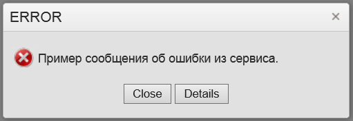
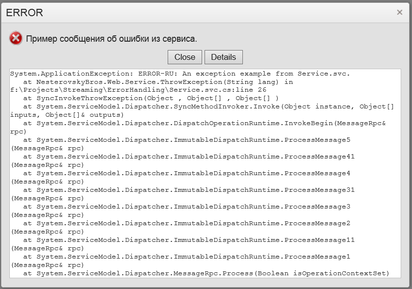
In the article "Error handling in WCF based web applications"
we've shown a custom error handler for RESTful service
based on WCF. This time we shall do the same for Web API 2.1 service.
Web API 2.1 provides an elegant way to implementat custom error handlers/loggers, see
the following article. Web API permits many error loggers followed by a
single error handler for all uncaught exceptions. A default error handler knows to output an error both in XML and JSON formats depending on requested
MIME type.
In our projects we use unique error reference IDs. This feature allows to an end-user to refer to any error that has happened during the application life time and pass such error ID to the technical support for further investigations. Thus, error details passed to the client-side contain an ErrorID field. An error logger generates ErrorID and passes it over to an error handler for serialization.
Let's look at our error handling implementation for a Web API application.
The first part is an implementation of IExceptionLogger
interface. It assigns ErrorID and logs all errors:
            /// Defines a global logger for unhandled exceptions.

            public class GlobalExceptionLogger : ExceptionLogger

            {


            /// Writes log record to the database synchronously.


            public override void Log(ExceptionLoggerContext context)


            {


            try


            {


            var request = context.Request;


            var exception = context.Exception;


            var id = LogError(


            request.RequestUri.ToString(),


            context.RequestContext == null ?


            null : context.RequestContext.Principal.Identity.Name,


            request.ToString(),


            exception.Message,


            exception.StackTrace);


            // associates retrieved error ID with the current exception


            exception.Data["NesterovskyBros:id"] = id;


            }


            catch


            {


            // logger shouldn't throw an exception!!!


            }


            }


            // in the real life this method may store all relevant info into a database.


            private long LogError(


            string address,


            string userid,


            string request,


            string message,


            string stackTrace)


            {


            ...


            }

            }
The second part is the implementation of IExceptionHandler:
            /// Defines a global handler for unhandled exceptions.

            public class GlobalExceptionHandler : ExceptionHandler

            {


            /// This core method should implement custom error handling, if any.


            /// It determines how an exception will be serialized for client-side processing.


            public override void Handle(ExceptionHandlerContext context)


            {


            var requestContext = context.RequestContext;


            var config = requestContext.Configuration;


            context.Result = new ErrorResult(


            context.Exception,


            requestContext == null ? false : requestContext.IncludeErrorDetail,


            config.Services.GetContentNegotiator(),


            context.Request,


            config.Formatters);


            }


            /// An implementation of IHttpActionResult interface.


            private class ErrorResult : ExceptionResult


            {


            public ErrorResult(


            Exception exception,


            bool includeErrorDetail,


            IContentNegotiator negotiator,


            HttpRequestMessage request,


            IEnumerable<MediaTypeFormatter> formatters) :


            base(exception, includeErrorDetail, negotiator, request, formatters)


            {


            }


            /// Creates an HttpResponseMessage instance asynchronously.


            /// This method determines how a HttpResponseMessage content will look like.


            public override Task<HttpResponseMessage> ExecuteAsync(CancellationToken cancellationToken)


            {


            var content = new HttpError(Exception, IncludeErrorDetail);


            // define an additional content field with name "ErrorID"


            content.Add("ErrorID", Exception.Data["NesterovskyBros:id"] as long?);


            var result =


            ContentNegotiator.Negotiate(typeof(HttpError), Request, Formatters);


            var message = new HttpResponseMessage


            {


            RequestMessage = Request,


            StatusCode = result == null ?


            HttpStatusCode.NotAcceptable : HttpStatusCode.InternalServerError


            };


            if (result != null)


            {


            try


            {


            // serializes the HttpError instance either to JSON or to XML


            // depend on requested by the client MIME type.


            message.Content = new ObjectContent<HttpError>(


            content,


            result.Formatter,


            result.MediaType);


            }


            catch


            {


            message.Dispose();


            throw;


            }


            }


            return Task.FromResult(message);


            }


            }

            }
Last, but not least part of this solution is registration and configuration of the error logger/handler:
            /// WebApi congiguation.

            public static class WebApiConfig

            {


            public static void Register(HttpConfiguration config)


            {


            ...


            // register the exception logger and handler


            config.Services.Add(typeof(IExceptionLogger), new GlobalExceptionLogger());


            config.Services.Replace(typeof(IExceptionHandler), new GlobalExceptionHandler());


            // set error detail policy according with value from Web.config


            var customErrors =


            (CustomErrorsSection)ConfigurationManager.GetSection("system.web/customErrors");


            if (customErrors != null)


            {


            switch (customErrors.Mode)


            {


            case CustomErrorsMode.RemoteOnly:


            {


            config.IncludeErrorDetailPolicy = IncludeErrorDetailPolicy.LocalOnly;


            break;


            }


            case CustomErrorsMode.On:


            {


            config.IncludeErrorDetailPolicy = IncludeErrorDetailPolicy.Never;


            break;


            }


            case CustomErrorsMode.Off:


            {


            config.IncludeErrorDetailPolicy = IncludeErrorDetailPolicy.Always;


            break;


            }


            default:


            {


            config.IncludeErrorDetailPolicy = IncludeErrorDetailPolicy.Default;


            break;


            }


            }


            }


            }

            }
The client-side error handler remain almost untouched. The implementation details you may find in
/Scripts/api/api.js and Scripts/controls/error.js files.
You may download the demo project here.
Feel free to use this solution in your .NET projects.
Earlier we have written a post
KendoUI's slowest function and now,
we want to point to the next slow function, which is kendo.guid().
It's used to assign uid to each observable object, and also in couple
of other places.
Here is its source:
   guid: function() {


            var id = "", i, random;


            for (i = 0; i < 32; i++) {


                random = math.random() * 16 | 0;


                if (i == 8 || i == 12 || i == 16 || i == 20) {


                    id += "-";


                }


                id += (i == 12 ? 4 : (i == 16 ? (random & 3 | 8) : random)).toString(16);


            }


            return id;

        }
KendoUI people have decided to define uid as a string in format of
Globally unique identifier.
We think there is no reason to have such a complex value; it's enough to
have counter to generate uid values. As KendoUI relies
on the string type of uid, so we have defined a patch like this:
  var guid = 0


  kendo.guid = function()
  { return ++guid + ""
  }
Consider now a test case. It's almost identical to that in previous post:
<!DOCTYPE html>

      <html>


<head>


  <title>Test</title>


  <script src="scripts/jquery/jquery.min..js"></script>


  <script src="scripts/kendo/kendo.web.min.js"></script>


  <link href="styles/kendo.common.min.css" rel="stylesheet" />


  <link href="styles/kendo.default.min.css" rel="stylesheet" />


  <link href="styles/style.css" rel="stylesheet" />


  <script>

      var model;


      function init()

      {


  var source = [];


  for(var i = 0; i < 1000; ++i)


  {


    source.push({ text: "value " + i, value: "" + i });


  }


  model = kendo.observable(


  {


    value: "1",


    source: new kendo.data.DataSource(


    {


      data: source


    })


  });


  model.source.read();

      }


      function patch()

{


  var base = kendo.data.binders.widget.source.fn._ns;


  var result;

  var guid = 0;


  kendo.guid = function()
  { return ++guid + "";
  };


  kendo.data.binders.widget.source.fn._ns = function(ns)


  {


    return ns ? base.call(this, ns) :


      (result || (result = base.call(this, ns)));


  }

}


      function test()

      {

  init();


  kendo.bind("#view", model);

      }


      patch();


  </script>

      </head>

      <body>

      <p>


    <button onclick="test()">Click to start test</button>

      </p>

      <p id="view">


    Select:


    <input data-role="dropdownlist"


      data-bind="value: value, source: source"


      data-text-field="text"


      data-value-field="value"/>

      </p>

      </body>

      </html>
Now, we can compare performance with and without that patch.
Here is a run statistics without patch:
| Level |
Function |
Count |
Inclusive time (ms) |
Inclusive time % |
Avg time (ms) |
| 1 |
onclick |
1 |
270.73 |
100 |
270.73 |
| 1.1 |
test |
1 |
269.73 |
99.63 |
269.73 |
| 1.1.1 |
init |
1 |
117.07 |
43.24 |
117.07 |
| 1.1.1.1 |
guid |
1,001 |
72.05 |
26.61 |
0.07 |
| 1.1.2 |
bind |
1 |
152.65 |
56.39 |
152.65 |
and with patch:
| Level |
Function |
Count |
Inclusive time (ms) |
Inclusive time % |
Avg time (ms) |
| 1 |
onclick |
1 |
172.64 |
100 |
172.64 |
| 1.1 |
test |
1 |
171.65 |
99.42 |
171.65 |
| 1.1.1 |
init |
1 |
62.04 |
35.94 |
62.04 |
| 1.1.1.1 |
guid |
1,001 |
1 |
0.58 |
0 |
| 1.1.2 |
bind |
1 |
109.6 |
63.49 |
109.6 |
Note that statistics were collected for IE 10.
An example can be found at
slow2.html.
What is the slowest function in kendo?
Or better, which function has most negative performance impact in kendo.
Recently, we were dealing with a simple page, which was too
slow, as data binding took more than second.
The page contained a dropdown list, with ~1000 options. To understand the
reason we have run this page under the IE's built-in javascript profiler, and
...
there, we have found that almost half of the time is taken by a function
(call it X), which receives nothing and returns always the same result!
But, let's now see a minimal example that demostrates the problem:
<!DOCTYPE html>

      <html>


<head>


  <title>Test</title>


  <script src="scripts/jquery/jquery.js"></script>


  <script src="scripts/kendo/kendo.web.min.js"></script>


  <link href="styles/kendo.common.min.css" rel="stylesheet" />


  <link href="styles/kendo.default.min.css" rel="stylesheet" />


  <link href="styles/style.css" rel="stylesheet" />


  <script>

      var model;


      function init()

      {


  var source = [];


  for(var i = 0; i < 1000; ++i)


  {


    source.push({ text: "value " + i, value: "" + i });


  }


  model = kendo.observable(


  {


    value: "1",


    source: new kendo.data.DataSource(


    {


      data: source


    })


  });


  model.source.read();

      }


      function test()

      {


  kendo.bind("#view", model);

      }


      init();


  </script>

      </head>

      <body>

      <p>


    <button onclick="test()">Click to start test</button>

      </p>

      <p id="view">


    Select:


    <input data-role="dropdownlist"


      data-bind="value: value, source: source"


      data-text-field="text"


      data-value-field="value"/>

      </p>

      </body>

      </html>
There are two parts: initialization, and a test itself that starts upon button
click.
In the initialization part we have defined a model, containing a datasource.
The test part performs data binding.
Now, here is a run statistics:
| Function |
Count |
Inclusive time (ms) |
Inclusive time % |
Avg time (ms) |
| test |
1 |
456.05 |
100 |
456.05 |
| X |
1,000 |
200.14 |
43.89 |
0.2 |
So, X is fast by itself, but it run 1000 times, and took about 44% of all time.
And now, to the function. It's kendo.data.binders.widget.source.fn._ns.
Here is its code:
              _ns: function(ns) {


                ns = ns || kendo.ui;


                var all = [ kendo.ui, kendo.dataviz.ui, kendo.mobile.ui ];


                all.splice($.inArray(ns, all), 1);


                all.unshift(ns);


                return kendo.rolesFromNamespaces(all);

            }
We can see that on each call it receives a parameter undefined, and always returns an array with the same content.
Not sure why Kendo UI team made it so complex, but one can easily device a
simple patch that optimizes this code path.
function patch()

{


  var base = kendo.data.binders.widget.source.fn._ns;


  var result;


  kendo.data.binders.widget.source.fn._ns = function(ns)


  {


    return ns ? base.call(this, ns) :


      (result || (result = base.call(this, ns)));


  }

}
With this patch applied, the profiler shows:
| Function |
Count |
Inclusive time (ms) |
Inclusive time % |
Avg time (ms) |
| test |
1 |
253.03 |
100 |
253.03 |
| _ns |
1,000 |
6 |
2.37 |
0.01 |
Execution time dropped considerably, and _ns() loses its title of most time
consuming function!
An example can be found at
slow.html.
Recently we've seen an article
Why mobile web apps are slow.
While title mentions web apps, the the criticism is directed purely to javascript language. The answer presented there is twofold:
- Raw javascript performance is ~5 times slower than performance of native
code solving the same task.
This accounts for the most modern implementations that exploit JIT. Author does
not expect that this proportion will be significatly changed in javascript's
favor in the near future.
- Garbage Collection, which is essential part of javascript, does not work well
in constrainted environment of mobile devices.
Here author quotes many references that show that:
- for GC to work on peer with non-GC application, it needs to have ~6 - 8 times size of memory
than an application needs;
- at the same time for hardware reasons, mobile devices cannot provide such
amount of memory;
- on the other hand with rise of CPU performance, GC pressure rises even faster.
In the end author, while saying about some attempts to change the state, has no
final verdict, whether there can be anything done to remedy the problem.
Having roots in C++, we're GC unbelievers. But you know, who will ask your
opinion on that, while there are all those modern languages that try to abstract
from memory and implicitly or explicitly assume GC: java, C#, javascript, xslt,
xquery, and so on.
There always is a solution to avoid GC completely, like C++ and other (e.g.
Microsoft's C++/CX, or Apple's ARC) do. But, assuming you're entered GC world,
what can be done with it? How do you make it more predictable, less greedy, and
probably more fast?
Our arguments are like this.
How does native code manage object graphs?
Today's solution is reference counting along with weak references to break
cycles in graph.
Can be GC based on this?
Yes.
In fact upcoming spec of javascript contains weak references. So, provided a
developer accurately defines relations in an object graph, one may immediately
achieve the same efficiency as native solution.
If one does not use weak references consistently then object cycles can be
created, so there can appear a graph that is not referenced anywhere in a
program. This graph can be collected with classical GC that scans object roots.
Classical GC part can be used as a debug mode leak detector, and will collect
graph cycles at runtime.
Thus, we claim that a hybrid memory management: reference counting with weak
references plus classical GC is possible; it will be equal to a native memory
management when weak references are properly used, and it will be close to
classical GC without use of weak references.
This solution gives a rule to mitigate GC drawbacks: just use weak references in
appropriate points, and you can continue to live in GC world, where GC is only a
fallback.
|
 Comments [0] -
 Sunday, 07 July 2013
![[RSS]](http://www.nesterovsky-bros.com/weblog/themes/business/images/feedButton.gif)